How We Got Here: The Road to Balsamiq Mockups 3
The release of Balsamiq Mockups 3 was the biggest release in our history since the original product launch in 2008.
For this release we took a leap of faith and went nearly an entire year without releasing any real product updates (in comparison we released about once a month in 2013). At our annual retreat last year after not releasing any feature updates in nearly six months Peldi had to reassure us that we were still doing the right thing and to stay the course.
And fortunately people were still buying our product.
We also made up for the lack of Mockups for Desktop updates with big improvements to Mockups for Google Drive (yay, Sax!), and lots of updates to myBalsamiq and our website, documentation, and blogs.
This post is all about how we got to Balsamiq Mockups 3. It was a windy, bumpy road, full of changes in direction, fits and starts, delays, and uncertainty about the final product. (So, in other words, a pretty typical software development project.) But when we neared the end it all came together rather beautifully in a way that validated our organic and intuition (rather than market)-driven approach.
2011-2013: Mockups “Pro”
Long before any planning or design started we referred to the next generation of our product internally as “Mockups Pro.” This was convenient because we all agreed that our next major version would be Pro, even though we had different ideas about what “Pro” actually meant. Pro was either an abbreviation for Projects (bundling multiple files and assets into a single project file) or Professional (a separate, more feature-rich version of our product for heavy users) depending on who you talked to.
In late 2013 Peldi decided Balsamiq Mockups version 2 was stable and feature-rich enough to start something new.
Mike had already been working on a UI overhaul as a side project and kicked things off with a comp to give us some inspiration.

The “Pro” idea and Mike’s vision of improving the appearance and standardizing the interaction provided the fertile ground for us to start our next adventure.
But we knew that the next version was not just about adding features or a fresh coat of paint. So we began with some important questions that kept us focused throughout the project.
From a wiki page created in 2013:
- How we can evolve it [Mockups] without breaking from what’s become “the ethos of Mockups?” There is a definite character we want to hold on to, while maturing it. People want that.
- What things should not change on the surface?
- What things should not change about the experience?
- What things are so effective that they create “Flow” when using the app?
- What are the things that contribute to a sense of effortless and ease (and effortless effort), as if “the wireframes just make themselves?”
These questions and some heavy discussions lead us to a set of design principles and the following guidelines for our next project:
- Stick to our basic identity (that had made Mockups successful in the first place)
- Make it easier to use (especially by reducing friction around pain points)
- Introduce professional and power-user features without overwhelming the UI
And, with that, we moved on to…
2013-2014: Mockups 2.5
We knew that before we got any further we had to settle the “Pro” debate once and for all. Should we create two separate versions of our product, one for occasional users and another with more bells and whistles for “professional” users?
We started out thinking that we would. For a long time we maintained a separate feature tracking project for only “Pro” features. It contained every “wouldn’t it be cool if…” big idea that customers and employees had suggested over the years.
But something was holding us back. I think it was more a gut feeling than anything else, largely coming from Peldi and Mike. On a wiki page called “Future of Mockups User Experience” Mike summarized Peldi’s concerns as follows:
Peldi had a simple vision for Standard [the non-Pro version] that he was excited about. He isn’t excited about a tool that essentially comes close in appearance and function to graphic design tools like Photoshop or prototyping tools like Axure.
Clearly a more powerful tool could be both useful and profitable, but was it something we were excited about building? Fortunately, our decision to remain small and independent allowed us to ask this question rather than just thinking about what would bring in the most money.
Then there was this action item further down the page:
Go back from the start and ask “why did we think of doing a Pro version in the first place? What are the things that just don’t belong in Standard? What problem are we trying to solve with Pro?”
This question of “what problem are we trying to solve?” has frequently shown us the way in times of indecision. And this time it reminded us that Peldi’s original vision hadn’t really changed - to help rid the world of bad software by allowing anyone to quickly and easily visualize their product ideas.
So we decided to channel our efforts into building an update to Balsamiq Mockups that retained the current core functionality and ease but alleviated pain points and cruft that had accumulated as the product had grown.
The Pro label disappeared and the project was dubbed “Mockups 2.5” (the current version was 2.2) since it felt like a big, but not HUGE (e.g., full of new power-user features) update.
Mike created some quick comps that didn’t look radically different from the existing version at the time, Mockups 2.2.

Our focus narrowed to a few specific targets addressing our customer’s biggest frustrations:
- Support for bundled project files instead of separate files for each mockup
- Improve the usability of Symbols
- Redesign the UI layout for a better editing experience (including figuring out what to do with the floating “property inspector” window/widget/thingy that bugged everyone so much)
We made a list of additional features that we'd then work on in "follow up releases."
After many rounds of iteration we started building it and had a working build ready in a relatively short time.
Here’s an early demo from a test build.
Mockups 2.5 was nearly ready.
But were we?
2014: "Panels" + "BMPR" = "B3"
Indecision returned as we reviewed our concepts and requirements. What should this release include? We discovered that there were so many things that we were excited about building into the product. Auto-save? Yes! Project notes? Yes! Preferences dialog? Still no. JSON instead of XML? Yes! Default font settings? Yes! Trash? You get the picture...
It was starting to sound like a pretty big project. Too big for a “minor” (a.k.a. “dot”) update…?
We left that question alone and went back to something more certain. We knew that we wanted the UI layout to have the mockups on the left, the canvas in the center, and the UI Library and Properties on the right. So we just started calling what we were working on Panels because of the UI “panels” on the left and right.
Our high-fidelity "vision" comps gave way to detailed high- and low-level wireframes describing interactions, flows, and layout as we fleshed out more details.
Peldi created a video walkthrough of some of his mockups for the Panels UI.
Notice how effective a simple click-through wireframe deck can be when accompanied by someone walking you through it? This is an example of the design workflow we promote. We generally don't see the need to create high-fidelity, fully interactive prototypes to convey our ideas and this project was no exception.
Peldi, Andrea and Michele were also deep into cleaning up the code at this point, looking at everything we had written in the last 7 years. They consolidated, removed and beautified code until it was actually readable and much more efficient. The clean slate gave us the energy to think more ambitiously about both the back end and front end.
This included a rewrite of our file format to accommodate the exciting new things we wanted to add. Marco and Paolo were borrowed from other projects to help. This spawned architecture diagrams, flow charts, and developer mini-retreats. Meanwhile, the UX team was discussing the toolbars, menus, icons, etc...

Finally, near the end of 2014 we started playing with test builds and trying it out internally. We called it "B3" (for Balsamiq 3). We'd talked about dropping "Mockups" from the product name for a while, since nearly all of our customers just called it "Balsamiq." Plus, what it creates are more accurately called wireframes than mockups. But it turned out to be a pain to change the name for a variety of reasons, so we called it Balsamiq Mockups 3. Although now we were more relaxed about just calling it Balsamiq in conversation. 😉
Late 2014: Ready for Feedback
We all felt that we had built something that was both more powerful and more elegant than the current version of Mockups. But we had no clue if our customers would feel the same way. It wasn't only a question of would they like it, but would they like it enough to switch, which would include learning some new things and, not insignificantly, converting their old files by importing them to the new format.
As we had done in the past we reached out to some of our long-time champions and friends for a closed beta test. We also conducted a formal usability test with help from Mike Heraghty at User Journeys. This uncovered a lot of technical and usability bugs and gave us some great qualitative feedback, including what to expect from people’s first impressions.
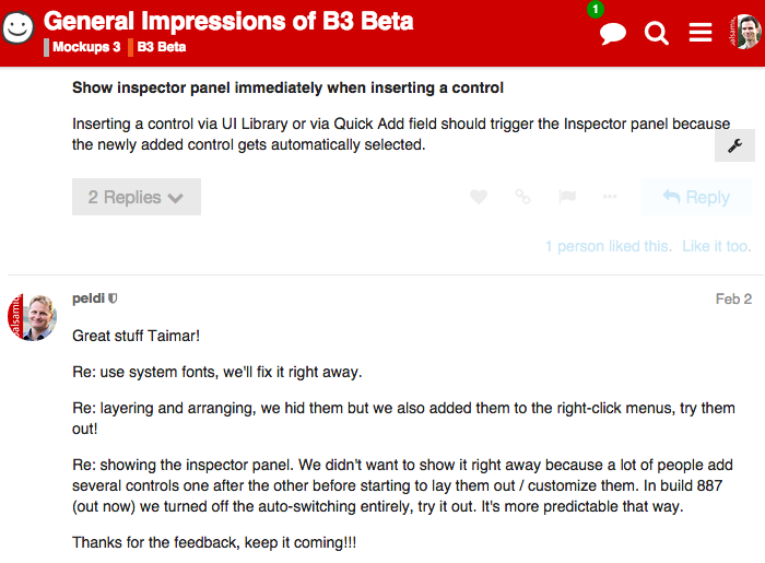
After a few more rounds of fixes and tweaks we felt like it was ready for a bigger test. On February 2nd, 2015 we announced the public beta and opened up our new community forums to talk about it.
While it was hard to take some of the tough feedback, the overall feeling of connecting and communicating directly with customers was energizing. For the old-timers at Balsamiq it took us back to the early days in the GetSatisfaction forums around version 1.
And the public beta lead to some great improvements in a short amount of time.
For example, the UI Library and Properties panel sharing the same space that we thought was so clever? It turned out that our customers didn’t agree. So we moved the UI Library back to the top.
Other notable additions during the public beta were Font Awesome icons and the Project Information panel, which included highly-requested settings for changing the default font and selection color.
We are so grateful to all of our beta testers for their time and patience. Releasing without beta testing first would have been a disaster and we feel so fortunate to have customers who wanted to help us make our product better.
Release!
March 10th, 2015: Release day! There were some hiccups, as expected, but it generally went very smoothly. And we had all-hands on deck to respond to issues that showed up upon releasing to a broader group of users. Two weeks later we released an update addressing most of them, followed by three more updates over the next few weeks.
Less than two months after the official release, we don’t know whether Balsamiq Mockups 3 will be a success for us. We know that we enjoy using it ourselves and that many of our customers do too. But we are hopeful because we followed a process that has worked for us in the past: a mix of passion, focus and openness that feels intuitively right to us.
If I had to distill from this entire process a few lessons we’ve learned from building this and other products it would be these:
- Build something you’re excited about
- Define the problem you’re trying to solve early on
- Involve your customers in a meaningful way at some point in the process
We’ve come a long way since 2.0. Thanks SO MUCH to all of our loyal (and new!) customers. We want Balsamiq Mockups to be a product that you love to use, so please let us know what we can do to make it even better!
 Leon for the Balsamiq Team


Comments (2)
Thanks Scott! 🙂
Congratulations to the team! I know how amazing it feels to ship.