myBalsamiq Beta Gets an Overhaul
It's been quiet around the UX blog for the past month. We've been heads down working on a beta refresh, making big usability improvements to the way you work with projects in myBalsamiq, and we've just released the latest iteration for our beta testers.
Watch Peldi's screencast below to take a look at what we've been up to.
Here's the full list of improvements and feature additions you'll find.
1. Simplified navigation views
We've transitioned from using Flex for the project, mockup, and asset views to using HTML. This means that those views will be rendered more quickly and should provide a familiar experience.
2. Home Page
The home page will show you a set of projects, visualized as sketchbooks on a desktop.
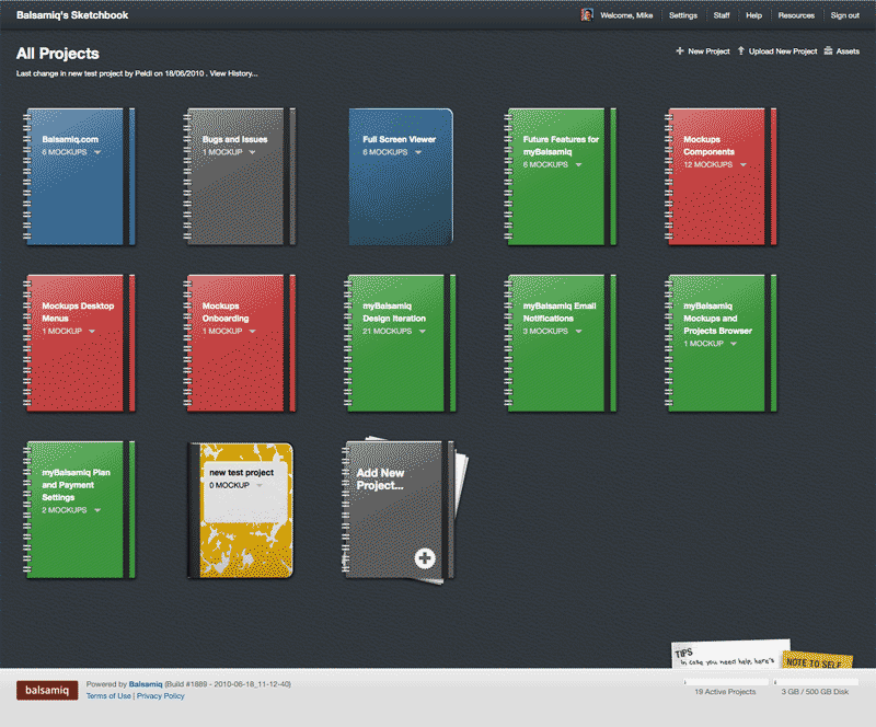
You can create or upload new projects and set a different style image to differentiate between them. The style of the home page background colors and texture can also be changed.
3. Project Page
The Project page shows your project mockups. When we moved to the simpler views on list pages, we also addressed some of the usability issues of controls. Some actions for objects in our project/mockup/asset browsers were far away from the objects. Now all actions are next to the object. View/Open is the default link, and there is an action menu to the right of the project title to access other options from those views, e.g. delete, edit, etc.
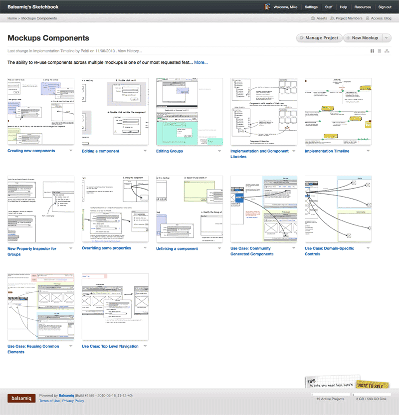
The order of your mockups is now important because we're introducing the story view. We've made ordering mockups simple using drag and drop. When you hover over a mockup in your project page, you'll see a gray grip bar appear above the mockup and the cursor becomes a move icon. Drag and drop to re-order. We've also provided direct manipulation cues in the thumbnail navigation on mockup pages.
4. Grid/Story/Map View
On your project page, you'll notice 3 icons in the right below the New Mockup button. These let you change the view of the project mockups between grid, story, and map. And when you've selected one of these views we'll remember and show you that view when you return until you select another one.
Grid is the thumbnail gallery view of your mockups, arranged in rows and columns. This will be your most common view.
The new story view allows you to see all mockups at 100% width in a single page with descriptions. This is useful when presenting your project to team members or possibly when printing. The linear order makes it easy to describe flow while scrolling through the entire project.
5. Mockup Page
The Mockup pages have been simplified. We've put the mockup center stage, spanning the entire page width. That was a small, but necessary change to help give our mockups focus and to fit wider mockup designs.
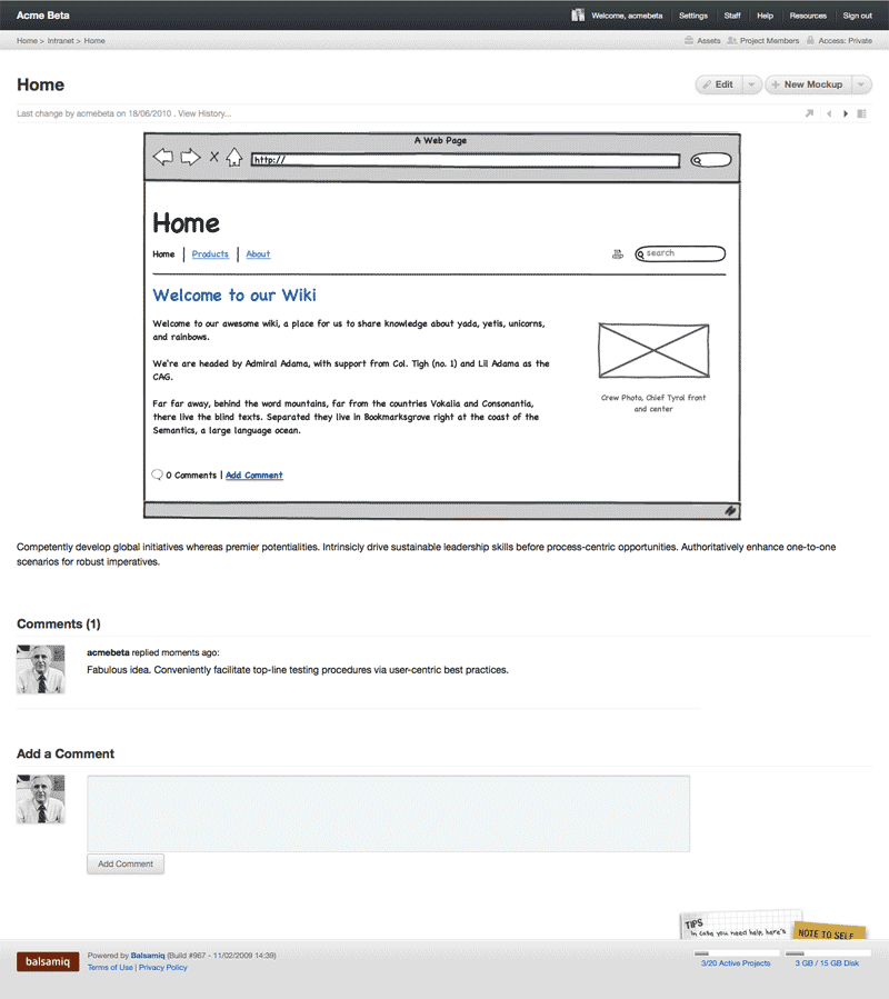
We now provide a new set of controls for navigation to previous/next mockup, displaying a list of all thumbnails in the current project, and opening the project in prototype view. In the small area below the Edit and New Mockup buttons, there are small icons for these actions.
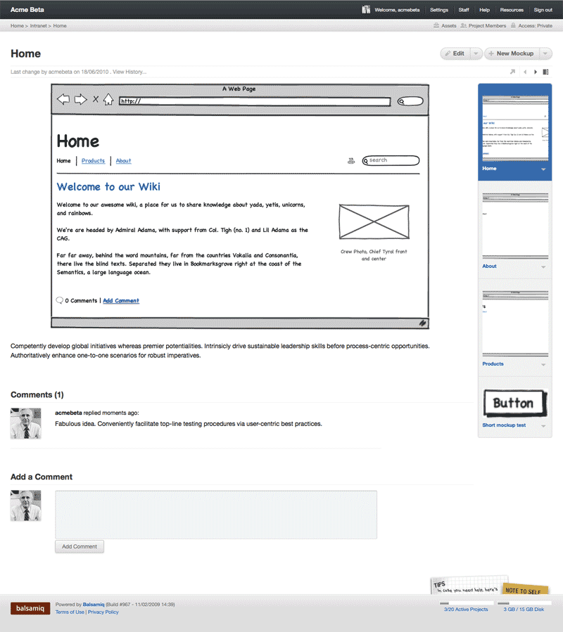
Prototype View: The arrow icon that points up and right opens a new window using the current mockup only--it removes the rest of the application interface.
Previous/Next Navigation: The left and right arrows allow you to navigate to the mockups before and after the one you're currently looking at. Hover over the arrows and you'll see a tooltip with the name of the mockup.
Thumbnail Navigation: The icon on the right will show a thumbnail navigator on the right of your mockup. This allows you to view the entire deck of mockups in the project so you can jump to a different one. You'll notice that the action menu arrows on the right of the mockup titles give you access to all the advanced options, and hovering over a thumbnail also displays the grip control so you can drag and drop to reorder right in this thumbnail strip. This is a big improvement over our previous heads up display.
6. New Prototype View
The Prototype view opens the mockup in a new page by itself without the surrounding myBalsamiq interface. If you have links in your mockups, you can now use your project as a click-through prototype for demonstrations and usability testing. It's super simple, but this feature will make your Mockups useful for more of the design and testing process.
7. New Project Team Menu
You'll still be able to contact your whole team or individual people via Skype chat, call, and email, as well as view your entire team map.
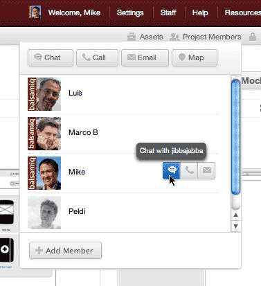
We've moved the controls for doing that to the upper right of the page in a header menu that's available everywhere on your site. We think it's a lot simpler now and it's nice to have it in one position, tucked away in the header.
8. New Access Control Menu
Setting access control is a lot easier to find and use. In the header menu on the upper right, you'll see a lock icon labeled Access. When you open the access menu, you'll see a slider that let's you set your access level.
9. New Account Settings
We've separated user settings (configurable options for you and your team) and the site account settings (admininstrator configurable options for the site).
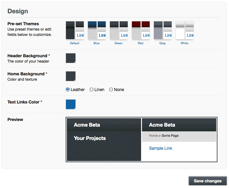
Among the account settings changes we've added are a set of pre-set themes to modify the design of your site, and color selectors to customize to your specific brand requirements.
The staff page combines the map of your project team so you can easily view people by availability, and the staff grid below provides an interface to manage your team with the same action menu on the right, which should now be familiar to you from the controls we described above.
That's all for now. We still have a log of bug fixing and improvements to implement. This is a major iteration, and releases with fixes should be more frequent from now on.
Current beta users can head to their myBalsamiq site. If you want to get notified when we open up the beta to more users, add your name to our invitation list.


Comments (2)
Peldi & team- Congratulations on all the progress! I just watched the demo video. You’ve crafted a beautiful, clean, professional-looking interface for the site — a great inspiration for cleanly-designed web apps that can be full-featured without throwing a confetti-shower of buttons in the user’s face. Can’t wait to play around with the released product.
Wow, this is amazing. I thought the desktop version was spectacular (it still is), but now I see what the web version will look like. I am very excited and wanted to congratulate you guys on your success, I look forward to using MyBalsamiq when it comes out. Fingers crossed.