Preview the Mockups Application Chrome Redesign
Hi, everyone. This year we're working on some projects to polish Mockups, and we want to give you a preview of one of them—the redesign of the application interface or app chrome.
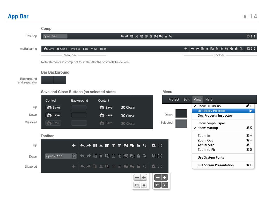
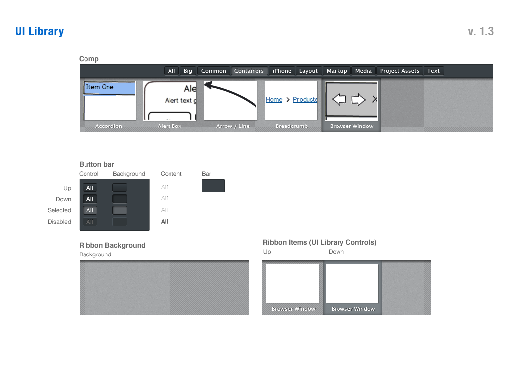
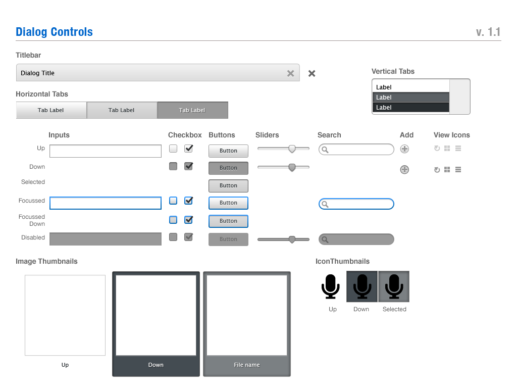
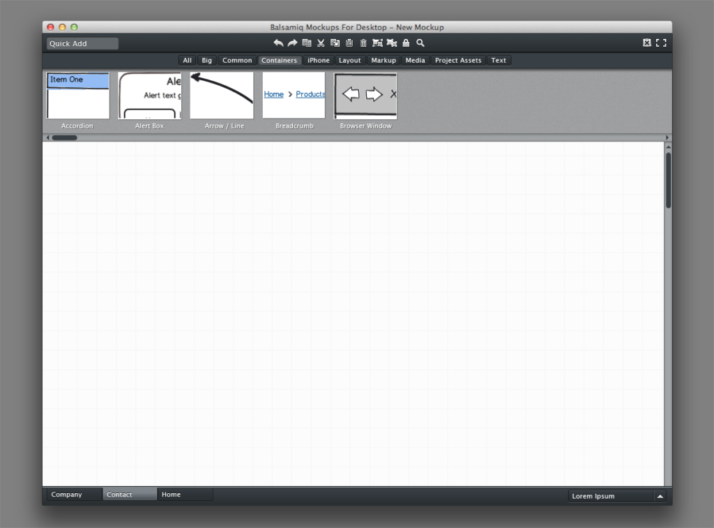
Application chrome refers to the user interface elements of the application window outside of the canvas. This includes such things as the menu bars, toolbars, progress bars, ui library browser, dialogs, and inspectors. Essentially what we're doing is polishing the design of Mockups itself.
With the release of myBalsamiq, we've started introducing some new interface elements in the app, especially the app bar. The chrome design hasn't changed much since Mockups was released, but with myBalsamiq, the accretion of elements has become noticable, and the changes more drastic. We wanted to refine this area, see what could be cleaned up or removed, and prepare for the future.
Goals
Now is the right time to focus on these:
- Fix usability issues related to visual design (contrast of scrollbars, for example).
- Making the myBalsamiq editor chrome match the design of the html views.
- Create a coherent design language and style that works across the Desktop, myBalsamiq, and plugin versions.
- Create an aesthetically pleasing experience that we want to look at every day.
- Prepare for desktop/myBalsamiq integration, and Mockups for Desktop Pro(jects).
On the surface you might say it's just a re-skinning of the chrome, and you'd be right. We're starting by cleaning up the current functionality.
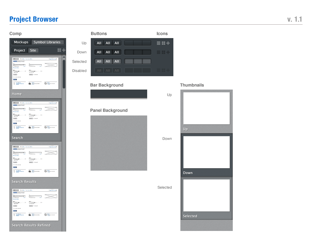
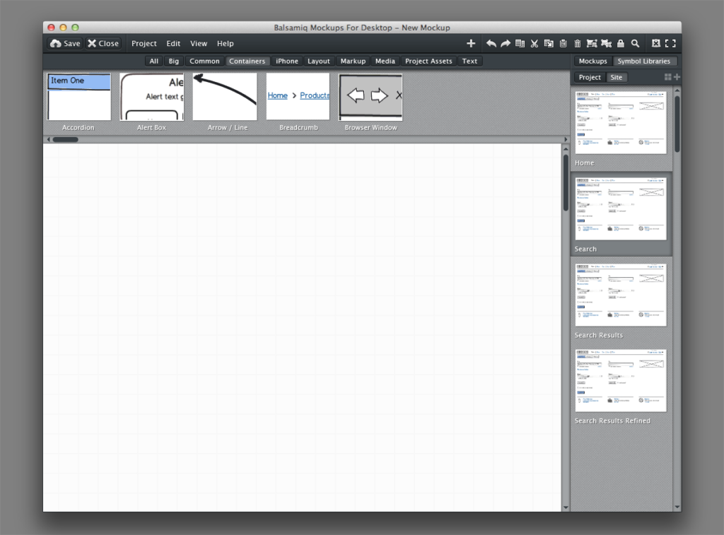
If you look closely at the design for mybalsamiq you'll also see that the interface includes a project (and symbol library) browser sidebar. As we move towards our goal of bridging Desktop and myBalsamiq, some of the design elements of the myBalsamiq editor will make it to the Desktop app.
Preview
Here are some design comps of what we've started implementing. Click to view larger.
Interface elements
For the documentation fans out there, here's a closer look at some of the design elements.
That's a quick preview at where we're headed. We hope you'll agree that the direction we're taking is a sensible one at this time. As always, we welcome your feedback with open eyes and ears. Leave a comment or email me at mike@balsamiq.com.
We know we have a long way to go. Every day we take another step.
You can try the pre-release here on the web or download the latest 2.2 candidate here. Bookmark that page and check it daily! 😉


Comments (8)
Hi, Jeff. Work towards integration between Desktop and myBalsamiq hasn’t been released yet, but a lot of the work towards that is underway, including real time collaboration, which is already available in the Google Drive plugin.
Did the better integration ever happen? I don’t see any noticeable integration between desktop and myBalsamiq (2014) other than the ability to download files from the web interface. It’d be nice to be able to save/open directly from desktop to the web.
Thanks for the feedback, Rico.
The idea for us was to use the same color scheme that we use in myBalsamiq, which was evolved from the dark gray of the original app. We want to create application chrome that recedes into the background and has enough contrast from the canvas, so we went in the same gray direction rather than going for a lighter app chrome bars. Red and yellow would go too much in the other direction, I fear, and draw your attention rather than recede into the background.
Looks slick, but for my taste a bit too much gray and too dark. I find that light and friendly colors (such as red and yellow) inspire creativity more than black and gray.
How about a color theme similar to the current one, but with the new UI elements?
Looking nice. Project view/management in the desktop can’t come soon enough – hacking with file naming is quite painful.
great stuff! looking good!
please add a ruler + grid function too! at leadt this is the only missing feature for me right now.
keep up the great work.
raph
Looking good guys!
A benefit I can see to polishing the Mockups interface is that the mockups themselves will look obviously like mockups because of the fidelity diff between the app and the mockups. Right now the mockups might be attributed to being low fidelity because of a low fidelity app.
Not sure I said that well, but it’s my way of saying the new design looks great. =)